October 2, 2024 - By: Victor Tang
Organize Your Data Visualizations in Multiple Dashboards
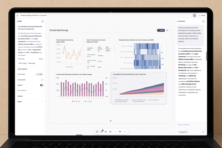
Breadcrumb Groups, a powerful new feature that allows you to organize multiple dashboards in one workspace for seamless data analysis.
At Breadcrumb.ai, we’re constantly evolving to ensure our users get the most efficient and engaging experience out of their AI data analytics. That’s why we’re thrilled to introduce Groups, a brand-new feature designed to enhance how you organize and interact with your data visualizations.
See it in action:
Now with Groups, you can create, manage, and view multiple analytic dashboards within the same space, bringing unprecedented clarity and flexibility to your data analysis process.
But what exactly does this mean for you and your teams? Let’s dive in and explore how Groups can transform the way you approach data visualization.

1. Centralized Data Analysis Across Multiple Categories
Imagine you’re managing multiple teams or departments—each with their own metrics and KPIs that need to be tracked regularly. With Groups, you can create a single space that houses several dashboards, each dedicated to different categories, teams, or projects. For instance, a marketing department can have one dashboard tracking campaign performance, while the sales department can have another focused on lead generation—all within the same workspace.
By allowing you to view and compare these dashboards side by side, Groups enables faster, more informed decision-making. You’ll be able to spot trends across departments, identify areas for improvement, and make connections that would otherwise be lost in siloed data.
2. Clearer Visualizations for Complex Data Sets
One of the biggest challenges when dealing with large datasets is maintaining clarity. Juggling multiple metrics across different domains often leads to a cluttered and overwhelming dashboard, which can obscure important insights.
The Groups feature tackles this head-on by giving you the ability to compartmentalize your visualizations. Each dashboard within a Group can focus on a specific set of metrics or visualizations, keeping things organized and easy to navigate. Want to track customer satisfaction by region, sales by product category, and website performance, all without confusion? With Groups, it’s possible—and seamless.
By breaking down data into focused, manageable sections, you enhance the clarity of each visualization, making insights easier to digest and share with your team.
3. A New Level of Customization
We understand that every business, team, and project has its own unique needs when it comes to data visualization. That’s why the Groups feature is designed to be as flexible as possible. You have the freedom to create custom dashboards for any use case—whether you’re managing different product lines, regions, customer segments, or marketing campaigns.
You can also customize the layout of your dashboards within a Group to ensure that the most important data is always front and center. Need to compare sales growth between two product categories? Place those dashboards side by side. Want to track operational metrics while monitoring the overall company performance? Now, you can do that without having to switch views or spaces.
Get Started with Groups Today
We believe Groups will revolutionize the way you work with data, helping you streamline your analysis, boost collaboration, and make smarter, faster decisions. This feature is now live and ready to use. We’ve only scratched the surface, over the next while we will be constantly enhancing it with group level filters, queries, and more. Fulfilling our vision of an agentic spatial exploration of data.
To start organizing your dashboards with Groups, log into your Breadcrumb.ai account today and explore how easy it is to set up and customize your own Groups. Your data just became more powerful—and more organized.
Here’s how you can use Groups:
• By department: Create separate dashboards for sales, marketing, and operations to track key metrics in one place.
• By product categories: Compare performance across product lines and spot trends faster.
• By data sources: Bring together data from multiple tools and analyze everything side by side.
If you have any questions or need help setting up Groups, we are here to assist you. Reach out to us at Slack, we’ll help you get started, and with the latest updates, tips, and success stories from our community of users.
Happy data exploring!